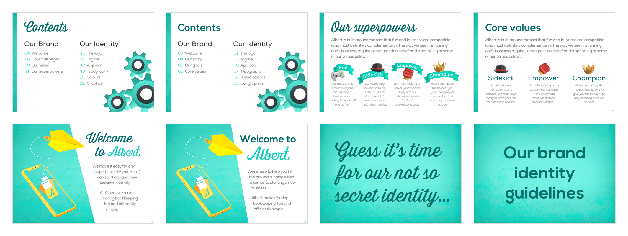
Brand guidelines - Albert
Albert is a free pocket bookkeeping mobile iOS app solution created by freelancers for freelancers. The app was well known for providing a unique solution to help the solo self employed manage their finances simply.
So the brand book idea began with the need to align the Albert marketing visuals (app, web, news articles, social media) starting by reviewing brand inconsistency issues as soon as possible.
The initial project "operation unify the brand look on all platforms" morphed into a full on brand re-design mission. I realised there was a big opportunity for Albert (as a fin-tech solution) to take the brand look to the next level (away from the typical "mobile app solution" website design crowd)
I began with a theme of freelancers actually being "everyday superheroes", people who swoop in to save the day when needed. The second bright idea I had was capturing the feeling that paperwork should be fun! Paperwork shall no longer be associated with legal/contracts/financial stress.
I borrowed a muiltitude of design techniques such as product design, agile as well as the more traditional design methods all to inform what became the final concept. Processes ranged from the lean canvas (to distill and understand the true core of what Albert was about), an unorthodox use of user testing (designing a prototype book to test brand tone of voice) to the more familliar design processes (moodboards and style tiles) to achieve the final result.
An additional bonus fact: This guide was completed within four weeks. Enjoy!
Check out the interactive Albert brand guidelines or scroll down to see the full brand book design journey.
Technologies used: Sketch, Adobe Photoshop, Adobe Illustrator.
Design: Ka-Mei Cheung
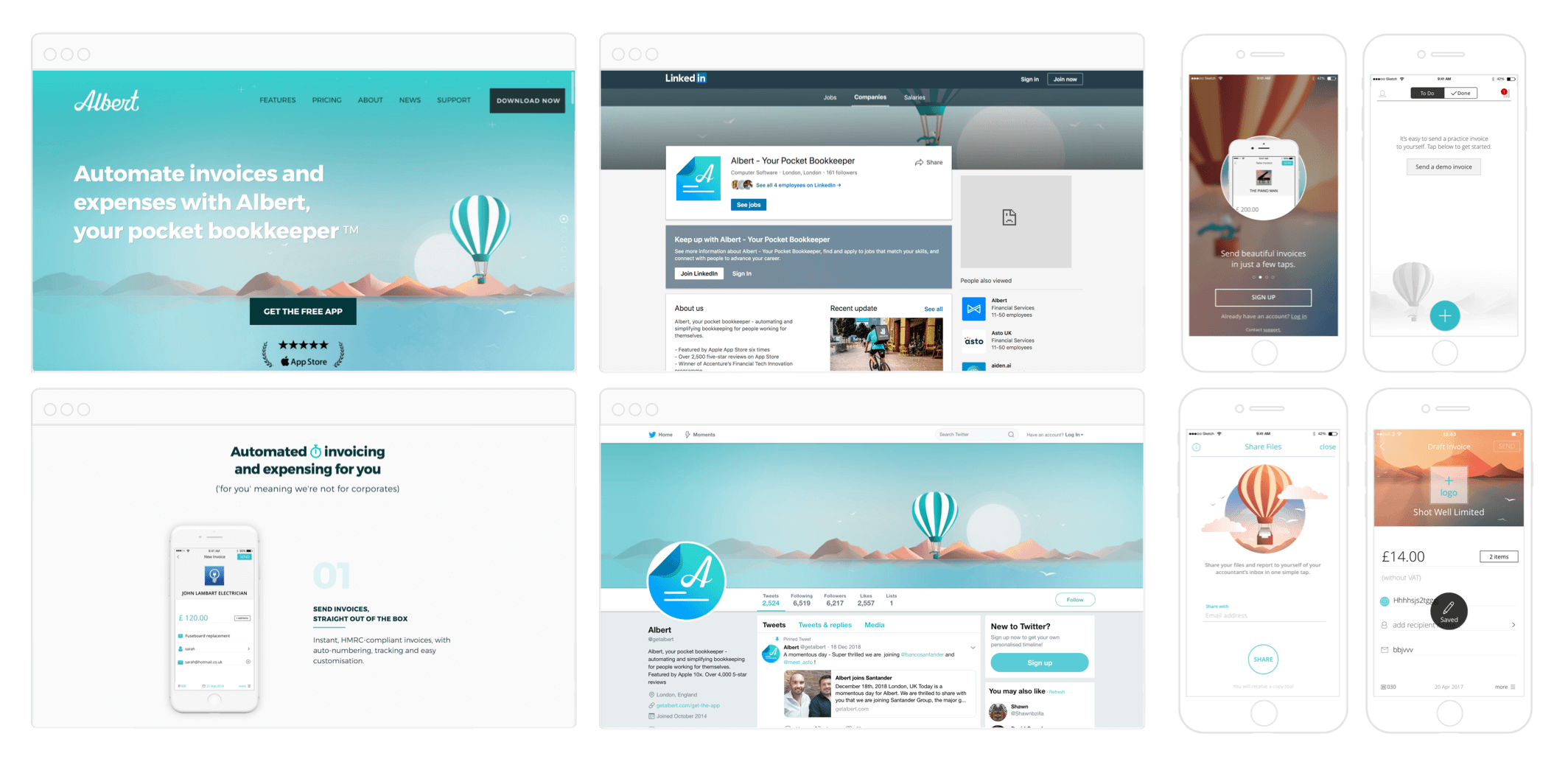
Albert web/app graphics
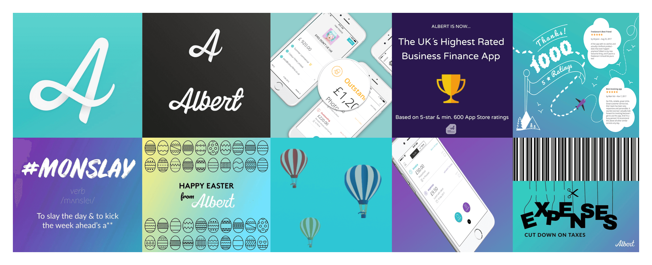
Marketing graphics
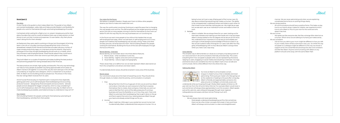
Brand manifesto docs
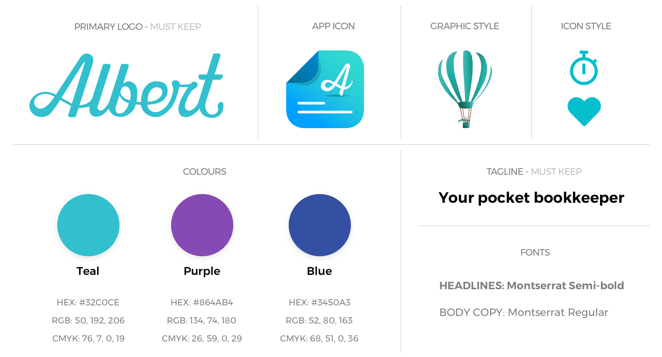
Albert current brand style tile
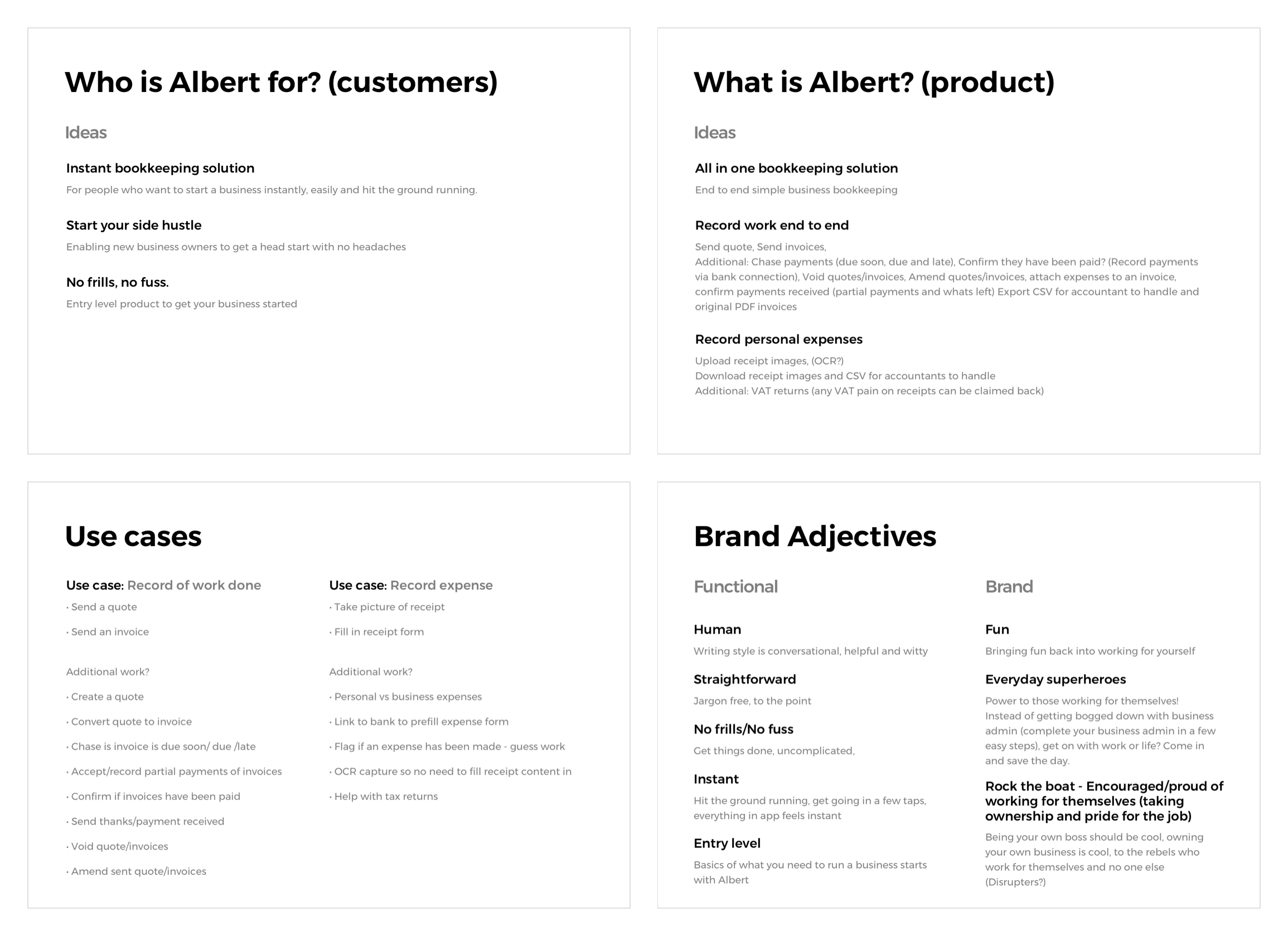
Product strategy notes
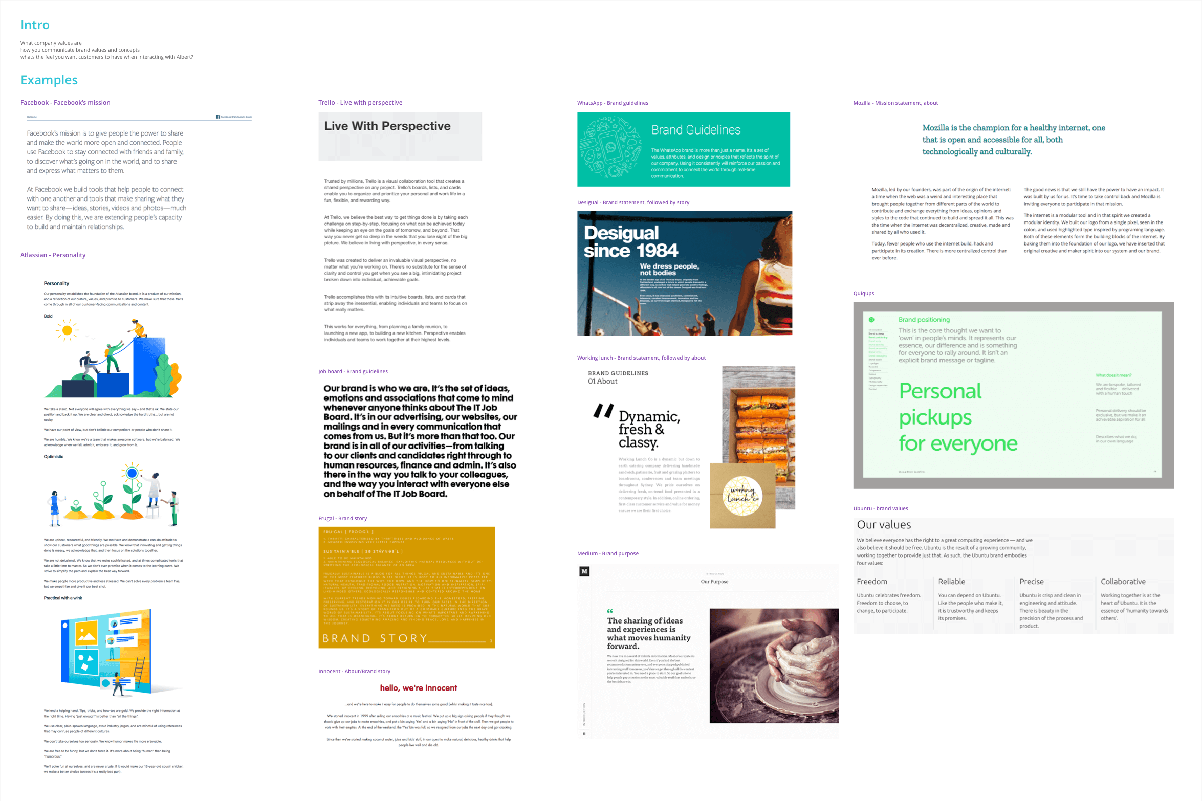
Brand guideline ideas research
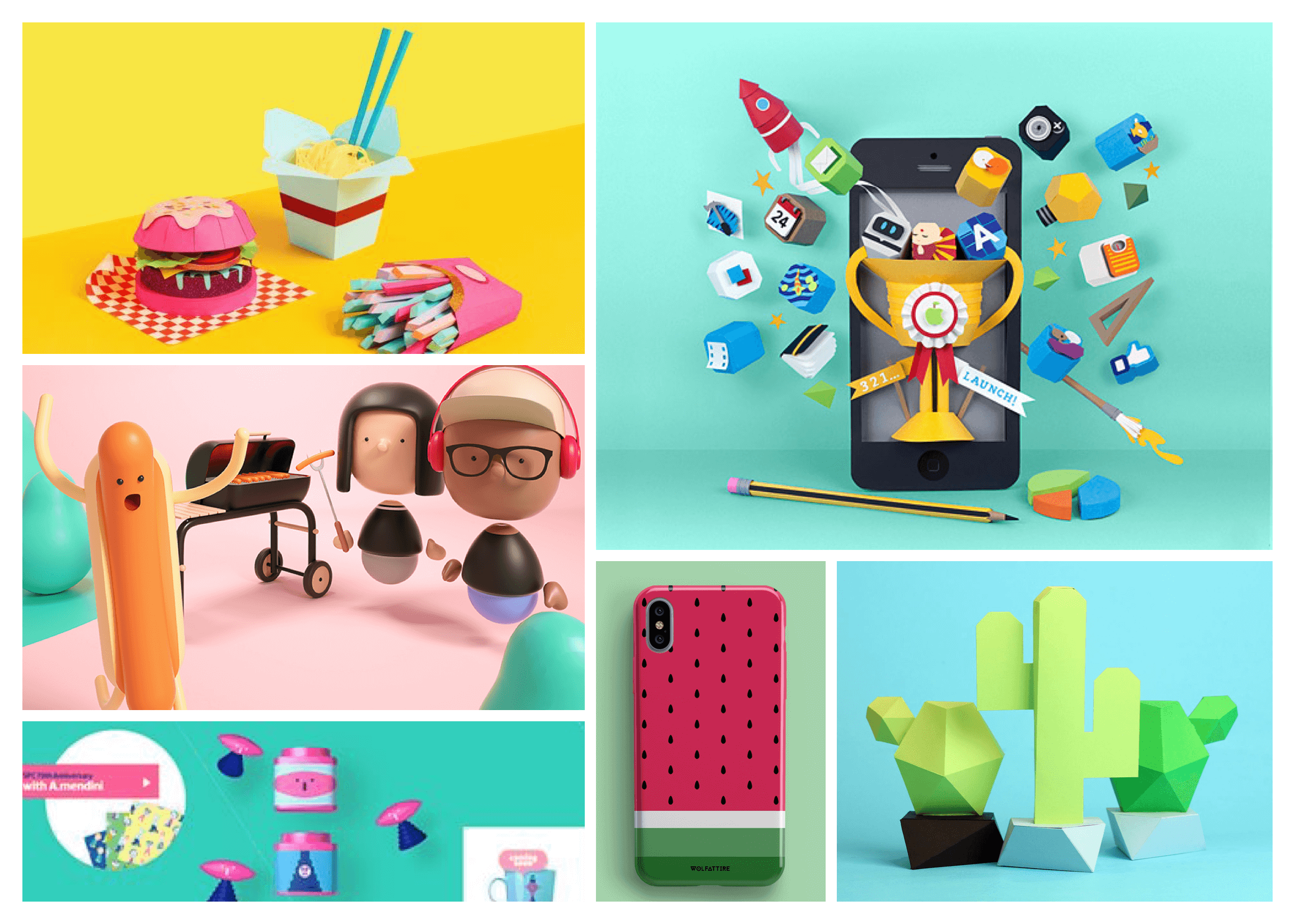
Graphic design styles moodboard
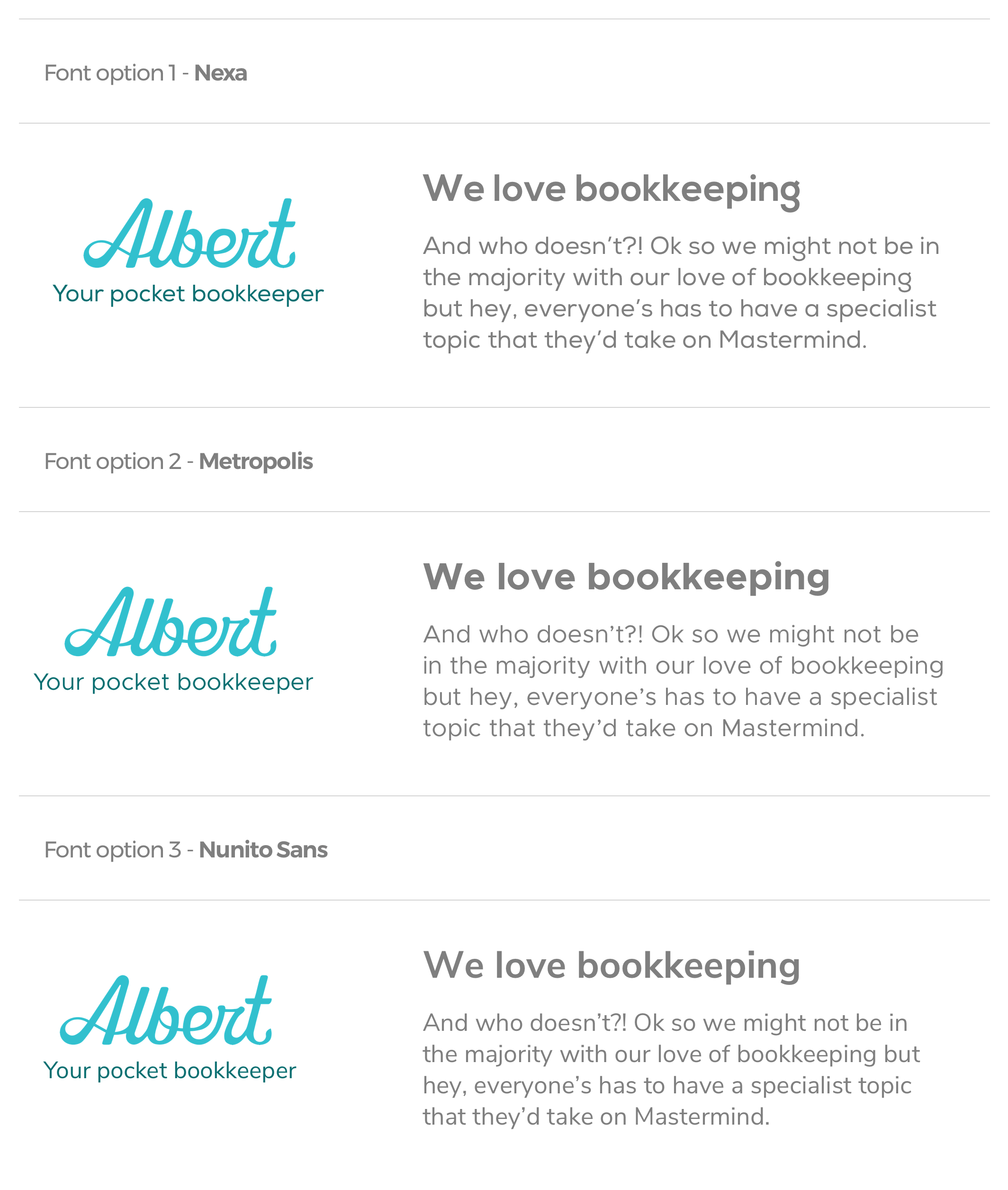
Font options shortlist
A/B tested copy approach